Wednesday, 11 May 2011

Thursday, 5 May 2011

Adding the art work to letter forms


Started to add the artwork to the letter forms only done one so far but should come out quite nicely

Finished From here to eternity artwork


Here is the finished A3 For the FHTE artwork

Finished Mercy Seat Montage


I have brought together all the elements of the montage for the 'Mercy Seat' art work here is the final piece .

Tuesday, 26 April 2011

Choice of typefaces

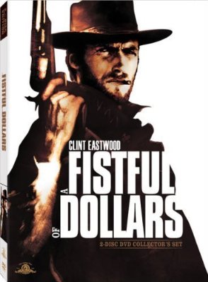
The most widely used typeface on wanted posters and perhaps most recognisable is 'claredon', actually an english typeface developed in 1845.

Claredon has been re-worked by HFJ and renamed Sentinel. Its recommend partners are, Knockout, Ziggurat, Chronicle text, and also Gotham. Knockout is the one that most suits the wanted poster/western design so I will be using that. And for any numbers i will also be using Numbers Delancy, that is a based on hand painted apartment numbering from the apartments in New York and suits the mood really well.

Examples of artwork


Heres some of the examples of artwork they were using at the time and some comparisons of other artwork in the same genres.

Thursday, 21 April 2011

Over to the other side


So far most of this blog has focused on the art work for the mercy seat. Well I've been creating the artwork for from her to eternity. I have chosen to do a typographic design. But i decided to go with a computer based design influenced by the art work of the band the time.

Its supposed to have wanted poster/victorian feel. I have started to make a portrait version of the artwork that will be submitted as a piece on its own but for the actual letters the art work will be arranged accordingly.

heres the work in progress...

Listen/Make into and instruction copy

Listen & Make

Have we lost our relationship with music? In the past 40 years the way we listen to and enjoy music has changed dramatically. From huge black 12” LP’s to smaller shiny CD’s through to today with some artist never actually producing a physical product, releasing music in the form of MP3’s and music videos.

Music has a profound affect on many of us, it can influence the way you dress, the company you keep and can influence, compliment and even alter your mood. Surely being able to carry around your entire music collection in your pocket has diluted the need to think about what music you want to listen to at certain times.

This must mean that people are taking less time to think about the way music affects them, and thus how music makes them feel. Listen & Make is an experiment into whether having a physical representation of a song helps us to visualise it better.

Here is the first instalment, LIVE/EVIL featuring two track by Nick Cave & The Bad Seeds, The Mercy Seat & From her to Eternity.

Instructions

1. Most importantly, have the selected song playing in the background

2. Cut out each character using a craft knife (the more time and care you take the better the out come)

3. Score along the inner fold lines

4. Fold the character, you should start to see it take shape now

5. Apply glue to the tabs and stick together the 3D character

6. Display forwards or backwards each side represents a different track.

Enjoy

Thursday, 24 March 2011

Photo Montage


Doing an image making project for something else but it should feed quite well into this, i want the cover of the give away pack to look something like this.

Wednesday, 23 March 2011

More Net Research


Got a pretty interesting takeout box from sainsburys so i filmed taking it apart and photographed the flat net for research.


.

Tuesday, 22 March 2011

Palindromes

As the letters will be covered both sides one side will be backwards so i came up with the idea of using a palindrome relating to the song

palindrome |ˈpalinˌdrōm|

noun

a word, phrase, or sequence that reads the same backward as forward, e.g., madam or nurses run.


so that which ever art work is preferred they can be displayed in that way.


i have found two so far that seem to fit the weird nature of the songs


"GOD SAW I WAS DOG"


&


"LIVE EVIL"


will look for more


Managed to find more material.

So as it turns out the mercy seat artwork is going to be a big photo montage so i've found some more really great weird twisted artwork to use in the montage.

Weird Black and White Shots, Click here


Saturday, 19 March 2011

From Her To Eternity

So far most of the project as centred around the artwork of 'The Mercy Seat', so I thought it was time to start thinking about the artwork for the other track.

My idea is to create a big typographic image using the lyrics. The song is basically about sort of obsessive love. So i thought it would lend its self well to maybe a ransom note style type treatment. I dont really like the cut out and stick letters but abit of letraset might look pretty cool.

I havent decided whether this is going to be hand drawn, computer based or a mixture of both.

Anyway here's the lyrics to give you a slight idea of the feel of the piece....

Ah wanna tell ya 'bout a girl
You kno, she lives in Apt. 29
Why... that's the one right up top a mine
Ah start to cry, Ah start to cry
O ah hear her walkin
Walkin barefoot cross the floor-boards
All thru this lonesome night
And ah hear her crying too.
Hot-tears come splashin on down
Leaking thru the cracks,
Down upon my face, ah catch'em in my mouth!
Walk'n'cry Walk'n'cry-y!!!
From her to eternity!
Ah read her diary on her sheets
Scrutinizin every lil piece of dirt
Tore out a page'n'stufft it inside my shirt
Fled outa the window,
And shinning it down the vine
Outa her night-mare, and back into mine
Mine! O Mine!
From her to eternity!


From her to eternity!
Cry! Cry! CRY!
She's wearing them bloo-stockens, ah bet!
and standin like this with my ear to the ceiling
Listen ah kno it must sound absurd
but ah can hear the most melancholy sound
ah ever heard!
Walk'n'cry! Kneel'n'cry-y!
From her to eternity!
O tell me why? Why? Why?
Why the ceiling still shakes?
Why the fixtures turn to serpants snakes?
This desire to possess her is a wound
and its naggin at me like a shrew
but, ah kno, that to possess her
Is, therefore, not to desire her.
O o o then ya kno, that lil girl would just have to go!
Go! Go-o-o! From her to eternity!


As you can see it already is sort of set out to emphasise particular sections

Wednesday, 16 March 2011

Mary Kelly / Aubrey Beardsley


Visited the Whitworth Gallery yesterday, there was an exhibition of Mary Kellys work alot of her work was in the same vain as some of the stuff i've been looking at. I wasn't allowed to take photos but i'll try and find some and add them later.


There was also so Aubrey Beardsley work there which was excellent.


Aubrey Beardsley (Top)
Mary Kelly (Bottom)

Tuesday, 8 March 2011

Un chien Andalou

I've also been watching some old old movies to get some more inspiration as well.

Un Chien Andalou was a short surrealist by Salvador Dali and Luis Brunel. Its full of weird scene that are pretty apt for this project.

Gunter Brus


Some of the work i've been looking at reminded me of Gunter Brus, who was an austrian painter, graphic and performance artist. He was part of the Viennese Actionist movement.

His work is pretty weird but i thought it would be good to draw influence from. I thinks probably exploring the whole movement abit more awell.

Monday, 7 March 2011

Printing


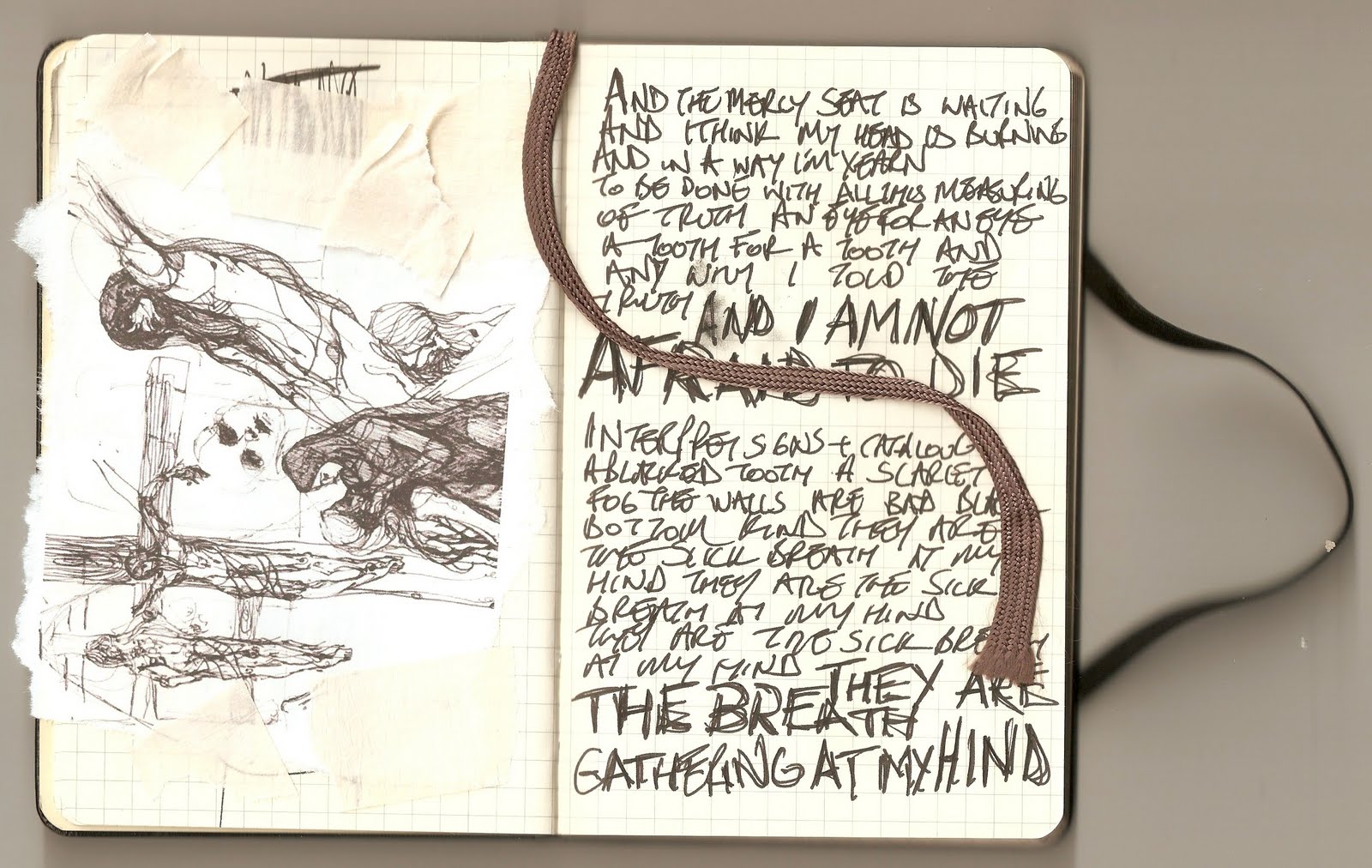
Had an idea of printing onto some different paper to get different effects. Found some creepy pictures of engravings and other bits, printed them onto graph paper and on layout paper.

The graph paper came out really cool.

Experimenting


Been playing around with different sketch books, pens and pencils. Writing on to masking tape as well. Getting some good results.

3D Letter Full Mock Up


After my first attempt at making the nets for the letters i found that they were slightly to weak, so i will have to use thicker card. I will also have to experiment with which panels i can leave out, as some of the nets cant all be made in one piece. I want them to be as simple as possible to construct. I have also changed the type face from Gotham Bold to Gotham Ultra, this gives me a slightly bigger canvas to work with and also structurally the forms should be more solid.

I mocked it up in illustrator to make sure. I have also found that some of the rounded letters will have to be slightly altered so that they have a flat surface to stand on.


Lyric Annotation


I have been through the lyrics to mercy seat and annotated bits and pieces mostly picking out key phrases, and looking up the bible references