Sunday 27 February 2011
Monday 14 February 2011


Sunday 13 February 2011
Research on nets

As the case for my project will look like a bit like a pizza box, i have been looking at experimental packaging and interesting ways to do it. I found this that is really impressive
Thursday 10 February 2011
No time like the present

Decided to jump right in and start to develope the nets for the 3D lets, seeing as the sooner i get this but done the more tim i can spend on the illustrations. Heres my first attempt at a letter A in Gotham bold (First typeface i've tried will probably change). Will be some time before i get this right, will post photos when i get time to print it and put it together.
Wednesday 9 February 2011
Hand painted numbers


After being quite inspired by the hoefler + fere jones numbers typeface, i have started to collect photos of hand painted numbers and letters that will be a good reference point for this project. First installment is a collection of numeric decals from above the some doors in my university.
Mercy Seat/Stagger Lee
Monday 7 February 2011
Louis Wain

Something else i quite like is when things are unexpectedly dark. There was an artist called Louis Wain who painted pictures of cat in sort of humanised situation. Playing guitar or at a tea party etc. But Wain spent most of his life in a mental institute, and was a manic depressive. There is something about it that makes seemingly boring sugary pictures alot more interesting. The Bad Seeds used a technique like this in there album 'the murder ballads', an album completely about murder, but all the inner artwork was beautiful engraving style pictures that are on there own quite innocent but in context have abit more to them.

Seven Title Sequence
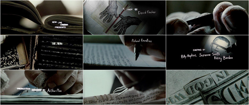
I've always thought the opening credits to the film seven were an amazing example of the kind of diaries i have been thinking about. I love how dark and weird the photos are, and the obsessive tight leading of the hand written text. This will now doubt be something i will look into in a lot more depth.
Strong Imagery
Part of the reason i have chosen NC&TBS is that they have always had quite a strong image. Always seen as quite dark and a bit macabre, with alot of religious imagery thrown in aswell.

Experimental Packaging

Typeface Combinations
Stagger Lee
Mercy Seat

LISTEN/PLAY Project Proposal
I have chosen to base my project on Nick Cave & The Bad Seeds. I have yet to choose which two songs but they will have to be ones that I can draw strong imagery from, I will explain why shortly.
Over recent years the way we listen to and enjoy music has changed dramatically, from 12” records to CD’s to MP3’s. I feel that a lot of people listen to music in such a rapid fashion that we don’t take time to appreciate it fully. Whether it be clicking through songs on shuffle with your MP3 Player, or listening to songs on the move.
Keeping this in mind I wanted to use this project to try and change that. I came up with a title for my project that is ‘Listen/Make’ this may change. But the idea is to create a promotional material to accompany the songs in a pack, as if they were being reissued for sale.
My plan is to make nets of 3D letters that spell out the name of the song; each letter will be decorated with a picture that represents different parts of the song, hence needing strong imagery. The idea being that the listener makes these letters while listening to song, hopefully giving a visual representation of the songs lyrics will mean that the listener absorbs the song on a deeper level, and then also has something to keep to remind them of the song.
I think this will give me a strong project for my portfolio. Showing my passion for type and that I have a good understanding of packaging design. I also think that the project gives me a chance to carry on exploring music-based graphics, which is going to hopefully be an important part of my future career.
D&AD Breif Deisel
Creative Challenge:
Over the past decade the world of music has undergone a revolution. Just as the ways people consume and experience music have been turned upside down, so the role of illustration in the world of music has changed too.
From the decline of the 12” album cover as a ‘creative canvas’, to the rise of downloadable tracks with artwork reduced to the size of a screen based icon. This situation has pushed people creatively to explore new opportunities that include street art, online video, experimental performances and interactive applications.
Your challenge is to choose a band or artist and create an illustrated response inspired by two of their tracks. In doing so, you’ll be facing this issue head on and demonstrating your vision of a brave new world for illustration in music.