Tuesday 26 April 2011
Choice of typefaces
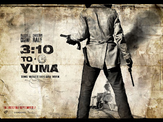
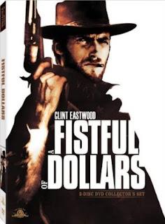
Claredon has been re-worked by HFJ and renamed Sentinel. Its recommend partners are, Knockout, Ziggurat, Chronicle text, and also Gotham. Knockout is the one that most suits the wanted poster/western design so I will be using that. And for any numbers i will also be using Numbers Delancy, that is a based on hand painted apartment numbering from the apartments in New York and suits the mood really well.
Examples of artwork
Thursday 21 April 2011
Over to the other side

So far most of this blog has focused on the art work for the mercy seat. Well I've been creating the artwork for from her to eternity. I have chosen to do a typographic design. But i decided to go with a computer based design influenced by the art work of the band the time.
Its supposed to have wanted poster/victorian feel. I have started to make a portrait version of the artwork that will be submitted as a piece on its own but for the actual letters the art work will be arranged accordingly.
heres the work in progress...
Listen/Make into and instruction copy
Listen & Make
Have we lost our relationship with music? In the past 40 years the way we listen to and enjoy music has changed dramatically. From huge black 12” LP’s to smaller shiny CD’s through to today with some artist never actually producing a physical product, releasing music in the form of MP3’s and music videos.
Music has a profound affect on many of us, it can influence the way you dress, the company you keep and can influence, compliment and even alter your mood. Surely being able to carry around your entire music collection in your pocket has diluted the need to think about what music you want to listen to at certain times.
This must mean that people are taking less time to think about the way music affects them, and thus how music makes them feel. Listen & Make is an experiment into whether having a physical representation of a song helps us to visualise it better.
Here is the first instalment, LIVE/EVIL featuring two track by Nick Cave & The Bad Seeds, The Mercy Seat & From her to Eternity.
Instructions
1. Most importantly, have the selected song playing in the background
2. Cut out each character using a craft knife (the more time and care you take the better the out come)
3. Score along the inner fold lines
4. Fold the character, you should start to see it take shape now
5. Apply glue to the tabs and stick together the 3D character
6. Display forwards or backwards each side represents a different track.
Enjoy


